How I Improved Lighthouse Performance by Adding an Image


URL copied to clipboard

Images and videos are slow to load, and most bloggers and companies are eventually coming to the tough decision of whether to take the UI train and include a hero image or going for performance and wave goodbye to the hero. My turn for my website was to go both ways!
In This Article
- The Impact of Loading Images
- Web Vitals - Largest Contentful Paint
- The Inconsistency of Getting a Great Largest Contentful Paint (LCP) Score
- How I Optimized Largest Contentful Paint (LCP) With an Image
- Choosing Between SVG, PNG and WebP
- An Attempt to Use a SVG and CSS Solution
- Optimizing WebP Image Size
- Serving Appropriately Sized Images
- Great Image Tools To Use
- Back To Network Latency
- Conclusion
The Impact of Loading Images
An image is on average a thousand times as destructive for performance as a thousand words. That's not a joke. Websites are commonly encoded using UTF-8, which uses 1-4 bytes per character, just 1 byte for standard ASCII letters. Average English word is about 5 characters, so a thousand words would be about 5 kB large. A quick google search on average image sizes on web tells us that's in about the same order of magnitude as those 5 kB of words.
Keep in mind that's just an average number. Hero and banner images which are meant to cover the half or full viewport of a website is most often at least several 100 times as large as that, maybe even a thousand if poorly optimized.
The image size isn't the only time thief when loading images on web. Images are usually fetched by the browser in a separate network request which means there will be an additional server request which incur additional latency, and the request may even have to be queued for a time by the browser. As we will see later in this article, this fact can have a considerable impact.

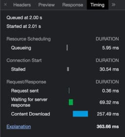
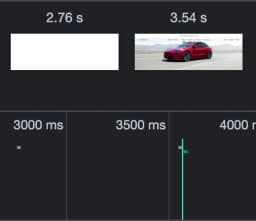
As an example, Tesla's banner image of their Model 3 Tesla is 1.2 MB large and takes 364 ms to load after having waited 2 seconds to start download on my network with a fairly old MacBook Pro. According to Google, 53 % of users will leave a mobile site that takes longer than 3 seconds to load. Just loading the image consumes a considerable share of that quota, and before it is finished rendered it has passed that time.
Web Vitals - Largest Contentful Paint
There are many ways measuring performance for a website. Google has initiated Web Vitals, which is a bunch of metrics that Google think are important for serving a good UX. One of the metrics is Largest Contentful Paint (LCP), which measures the time until the largest text or image on the page is visible.
Google has released an open-source tool called Lighthouse that can be used to measure web vitals and get scores and guidelines. It is built-in into Chrome Dev Tools but can also be used at PageSpeed Insights. The metrics shown is meant to be used as a guidance and can vary between each test.
Although Lighthouse is just for guidance, most or all of the metrics are used directly or indirectly by Google to rank your website when it gets indexed by Google. It's therefore not only important for good UX, but also for SEO.

The Inconsistency of Getting a Great Largest Contentful Paint (LCP) Score
While running Lighthouse speed tests at my website, I noticed that I got very different scores on different pages. My main page that lists articles and an article page scored significantly different on the performance metric, even though both pages was built almost in the same way with a profile picture, a lot of text and a few images. At the time doing this, the pages looked similar as today, but they did not have a hero image back then.
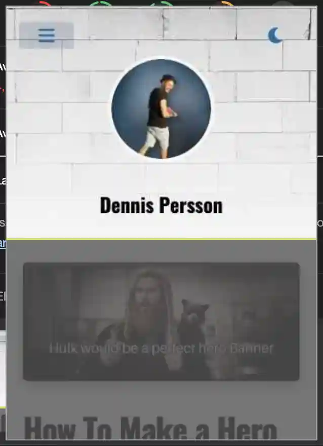
The culprit for the bad test result on the article page was the LCP score. The Lighthouse test provides a screenshot of the LCP, which made it clear why the article page did get a worse LCP score.
Since the main page had some extra chip components beneath the profile picture, the largest contentful paint on that page was the profile image. None of the dynamic blog articles was ever included in the viewport on a mobile device.

Meanwhile, on the article page, the first part of the blog article was included in the mobile viewport, meaning that Lighthouse was looking for the LCP in that area as well. The consequence, was that whenever an article began with an image, that image was treated as the LCP, since it was a larger image than my profile picture. If the image was left out, the profile picture was detected as the LCP.

How I Optimized Largest Contentful Paint (LCP) With an Image
I knew I couldn't keep going on with an unreliable LCP score, and it wasn't a good solution to never start an article with an image. I had to find a way to get a predictable score regardless of what content I included in the article itself.
With that in mind, I decided to add an image larger than any potential article image, I decided to add a hero image. That way, I could at least get control of which image was the largest and thereby take control over the LCP score.
For this to be effective, I had to use a hero image that was fast to load. Nothing would ever be better if I did like Tesla have done, adding a gigantic banner at the size of 1.2 MB. I had to use a small optimized image that could fill half the viewport, one that didn't scream poor resolution.
Choosing Between SVG, PNG and WebP
Well, I never really considered using a PNG image for the hero image, that's not the way to optimize web images. Although, I do always keep a PNG copy around for other usages. For example, when posting articles on DEV forum, they don't support WebP images to be uploaded as hero images.
Choosing between SVG and WebP was more difficult. SVG images can be really small if the image consists of a repeating pattern or an abstract pattern using only a few colors and shapes, just because they consist of vectors that can be scaled to any resolution. On the other hand, they will grow ridiculously big for graphic-heavy images with many colors and shadows, due to the high number of vectors required to represent the image.
On the contrary, WebP can compress images effectively by predicting and reusing pixels, making it superior to PNG and JPEG formats. So, the decision had to be between a minimal abstract hero image in SVG format or a realistic photograph in WebP format.
An Attempt to Use a SVG and CSS Solution
As you can see on my website, I do have a brick wall as the hero image (as long as you don't change the theme to dark mode). That image is in WebP format, but my first attempt was actually to use an SVG image. The brick wall I tried with then was less realistic and more cartoonish, which was served perfectly in SVG format.
To get rid of the extra network latency from fetching an image from a server, I embedded the image as a CSS background in a data URI, which should really only be done when dealing with tiny images because of cache and parsing reasons.
Did it work? No, it didn't, the CSS background wasn't detected as the LCP. After all, it is neither a regular image or a text, so it complies with Google's description of LCP.

Even though a CSS solution did not work as expected, it did work to use the SVG image in a normal HTML image element (or to be accurate, Next.js Image component in my case). The only reason I discarded that solution was because I wasn't satisfied with the cartoonish style of the brick wall, I felt I wanted a more realistic brick wall.
Optimizing WebP Image Size
After having decided to use a photograph of a brick wall as the hero image, it was time to optimize the size of it without losing too much quality. I felt that I didn't need a pixel-perfect photograph, it was fine for me to sacrifice quality for loading speed. The initial image was a JPEG monster at 18.1 MB and a 6000 x 4000 resolution, so it could be optimized a lot.

Now, compressing images is not at all what I am good at, I'm sure compression fanatics would have hit me with their compression bible if they hadn't already compressed it into a holy script at a few kilobytes. But I did succeed to compress the image a lot, compressing it into a 2560 x 1707 WebP image of 37 kB. Obviously, I lost a massive amount of quality, that has to be mentioned.

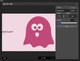
The approach I used to compress my image was to use an online copy of Photoshop called Photopea. Only thing I did was to resize the image and save it in another format, and choosing to lower the quality while saving.
Serving Appropriately Sized Images
A hero image with a 2K resolution is fine for a 4K monitor, but serving a 2K image to a mobile device is not optimal. Small devices should be served small images. That can be achieved using a HTML picture element with a srcset.
In my case, I didn't have to handle that, because my website is written using Next.js. They have a built-in image component which can be used to optimize image loading. At my blog, you can find a guide for implementing a hero image with that image component, it also explains the benefits of using it.
The image component Next.js offer does not only serve images in different sizes. They also support specifying a quality of the image so they can compress it for you. In my case, it didn't compress the image enough, I experienced better results compressing it myself using Photopea.
Great Image Tools To Use
When working with images, you often have to manipulate images in certain ways. To easier do that, I suggest checking out my list of free image tools. Those tools can be used to resize and reformat images and to generate images and backgrounds. It also presents websites which offers royalty free images.
Back To Network Latency
As I promised in the beginning of this article, we would look at how network requests can be the bottleneck when optmizing image loading times. Look at the picture below. It shows the network timing tab available in Chrome Dev Tools for the hero picture I use on my website. We can see that it takes the same amount of time to get a response from the server as it takes to download the picture.
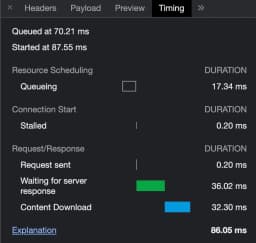
But Dennis, you say, your image is very small, only 37 kB. 32 ms isn't a very long time. Yeah, that's correct. It's nothing to care about. Or at least it wouldn't be if it wasn't because I had reloaded my page multiple times to get that screenshot.
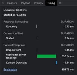
Reloading the page allows for the server to cache the image and serve it quickly the next time it is requested. When visiting my website during a cold boot at hours I don't have a lot of traffic to the site from Sweden, it can take 5, 10 or maybe 15 times as long time to get a response from the server. When that happens, the 32 ms download time for the image is negligible compared to the server response time.
Conclusion
What we learned in this article was that adding a large image to a website can actually improve Lighthouse performance tests. We learned what Largest Contentful Paint (LCP) is and how to optimize an image to maximize the LCP score.
We also took a look at when to use SVG images and when to use WebP images. I provided you with a list of free image tools which as an example can be used to reformat images in different ways, and explained the importance of keeping the image size low when using images on a website.
Finally, we saw an example of how server response time can be the bottleneck of web image performance when the images themselves has been compressed well enough to be very small.


